
Colour Drenching Living Room Ideas: A Beginner’s Guide to the One-Colour Look
Some living rooms whisper. A colour drenched living room hums — one confident colour wrapping the walls, woodwork, ceiling and even the furniture, until the room feels like stepping inside the shade itself. The look is now a full-blown trend: Pinterest UK searches for “colour drenching living room” are up 395%, with “colourful living room inspiration” up 370% and “whimsy room decor” up 655%. US readers will know the same technique as “color drenching.”
This guide covers the whole process: choosing a colour for your room’s light, the right finish for each surface, how far to take the drench, four proven palettes, realistic costs, and a partial version renters can undo in a weekend.
Key Takeaways
- Colour drenching wraps walls, trim, ceiling and furniture in one colour family — tonal depth, not one flat paint everywhere.
- Choose the colour under your room’s real light — north-facing rooms need warm undertones, small rooms can go deep.
- Keep one colour but vary the finish — matte walls, satin trim — so each surface still reads distinctly.
- Furniture, curtains and radiators join the drench at the fullest level.
- Renters can fake it convincingly: one painted wall plus textiles matched within two shades.
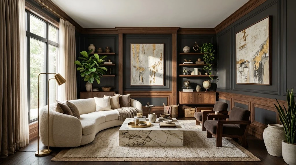
What Is Colour Drenching, Exactly?
Colour drenching means taking one colour family and letting it flood the whole room: walls, skirting boards, architraves, ceiling, doors and built-in joinery all wear shades of the same hue instead of the usual coloured walls plus white everything else. It is not an accent wall — there is no accent, because nothing is left out to contrast against. Nor is it flat monochrome: paint the identical tin colour on every surface and the room looks like a showroom box, whereas a proper drench works with a tonal ladder of the same hue.
The practical rule is three tones deep. Your mid-tone goes on the walls. A tone or two darker anchors the woodwork, bookcase backs or a painted piece of furniture. The lightest tone appears in textiles — cushions, throws, curtains — so the eye still finds layers. With the boundaries between wall, ceiling and trim gone, the room feels larger and calmer at once, and anything placed against it (art, plants, a beautiful chair) looks deliberately curated.
Choosing Your Colour: Light, Size and Mood First
Read the Light Before You Read the Paint Chart
Light changes colour more than any other factor, and drenching multiplies the effect because the colour surrounds you. North-facing rooms receive cool, blue-grey light all day, which can turn a pretty sage green muddy and make blue feel icy; in these rooms choose warm undertones — a green with yellow in it, a clay with red in it. South-facing rooms get warm, golden light, so they happily carry cooler colours like icy blue or a blue-based teal. Never commit from a paper swatch: paint a 60 × 60 cm patch on two opposite walls and check it at breakfast, mid-afternoon and under lamplight before deciding.
Match the Depth to the Room
Big, bright living rooms can carry mid-tones across the whole drench without feeling cave-like. Smaller or darker rooms have two good options: go pale and tonal (the lightest three tones of a family — airy and seamless) or go properly deep and lean into the cocoon, since deep colours blur a small room’s corners and read as luxurious rather than cramped under warm lighting. The awkward middle is a mid-tone in a dim room, which usually ends up flat and grey-beige. Pick a side.
The Right Paint Finish for Every Surface
One colour in one finish looks dead. One colour in several finishes looks designed, because light catches each surface differently. Use this breakdown:
- Walls: matte or soft eggshell emulsion. Matte hides imperfect plaster and gives the velvety backdrop the look depends on.
- Ceiling: dead-flat matte in the same colour — flat stops the ceiling reflecting light differently from the walls, which sells the wrapped feeling.
- Skirting, architraves and doors: satin or satinwood — scrubbable, slightly sheened, and the subtle gloss contrast separates trim from wall without changing colour.
- Radiators: heat-resistant radiator paint, or the same satinwood on a fully cooled, primed radiator. A painted radiator disappears; a white one shouts.
- Built-ins and furniture: eggshell or dedicated furniture paint; prime laminate or previously glossed pieces so the finish survives knocks.
Preparation matters more than usual here, because a single colour exposes every bump and drip. If your technique needs a refresher, work through a step-by-step guide to painting a room first — clean cutting-in and a wet edge are what separate an expensive-looking drench from a rushed one.
How Far to Take It: Three Levels of Drench
Level 1 — walls and woodwork. Paint the walls, skirting, architraves and doors, and leave the ceiling the palest tone of your colour rather than bright white (a stark white ceiling is the one thing that breaks the spell). Beginner-friendly, and it already transforms the room.
Level 2 — add the ceiling and radiators. Bring the full colour overhead and paint the radiators to match. The room feels genuinely wrapped, and low ceilings feel less oppressive without a hard white line overhead.
Level 3 — the full drench. Now the furniture joins in: paint the bookcase, media unit or sideboard in the darker tone, hang curtains in a fabric within two shades of the walls, and choose upholstery in the same family — a deep green velvet sofa inside a deep green room is the signature image of this trend. Paint the backs of open shelves the darkest tone so displayed objects pop. This is the level where visitors stop naming the colour and just say the room feels incredible.
4 Colour Drenched Palettes That Actually Work
Deep Green: The Cocoon
The most forgiving drench of all. A deep forest or racing green flatters warm wood, aged brass and cognac leather, and makes cream linen textiles — cushions, throws, lampshades — glow against it. Use it in north- or east-facing rooms, where its warm undertone stops the light turning it black. Add one living plant and the green-on-green effect looks intentional, not swampy.
Warm Terracotta and Clay: The Sun-Baked Room
Clay tones drench beautifully because they behave like a neutral with a heartbeat. Pair with blackened metal, rattan, raw timber and off-white upholstery, plus an olive cushion or two as the cool counterpoint. One warning: in strong south-facing light, terracotta can tip orange — choose the muddier, browner clay end there, and save bright orange tones for north-facing rooms that need the warmth.
Icy Blue: The Calm Wrap
Pinterest’s “Cool Blue” direction makes this the fashion-forward choice. Glacier and icy blues feel serene rather than cold when you drench with texture: pale timber floors, brushed steel or chrome, white and stone-coloured linen, and a chunky knit throw within the blue family. Best in bright, south- or west-facing rooms; in a dim room, warm it with 2700K lighting and natural wood or it can feel chilly.
Aubergine: The Evening Room
Deep aubergine is the drama choice, made for living rooms used mostly after dark. Lamplight turns it plush rather than purple-black, and it pairs superbly with antique gold, walnut, blush pink textiles and cream. Keep the floor and rug at the lighter end of the family so the room reads luxurious, not heavy, and let pale-mounted artwork provide breathing space.
Does Colour Drenching Work in a Small Living Room?
Yes — arguably better than in a big one. The usual advice to paint small rooms white assumes contrast defines space, but drenching works the opposite way: with no white trim lines or ceiling edge chopping it into pieces, the eye cannot find the boundaries, so the room reads bigger and more unified. To make it work, keep the floor pale (light wood, a stone-toned rug), hang one generous mirror to throw light back into the colour, and repeat the colour on the biggest piece of furniture so nothing fights the walls. More broadly, these small home decor ideas pair naturally with a drenched palette.
The Renter-Friendly Partial Drench
Renters cannot always paint — but drenching is about colour continuity, not paint, and most of it is reversible. Start with permission for one wall if you can get it; if not, build the colour field from things you own. Paint your bookcase, sideboard and a second-hand armchair in your chosen shade (painted furniture needs no landlord’s consent). Then match the big textiles to it: curtains, a large rug and sofa throws, all within two shades of that colour, so it fills most of the view. Add a large artwork or fabric wall panel in the same family behind the sofa. The result reads as a drench from the doorway, and everything reverses in a day when you move.
What Does Colour Drenching Cost?
For a typical living room of 4 × 5 m (about 13 × 16 ft), the walls total roughly 34 m² after deducting windows and doors. At about 12 m² per litre per coat, two coats need roughly 6 litres, plus 1–2 litres of satinwood for trim and doors and a litre of furniture paint at Level 3. At roughly $45–$65 (£35–£50) per 2.5-litre tin of quality paint, a full DIY drench with primer, tape and radiator paint usually lands between $180 and $450. A professional typically charges $700–$1,400 for the same room, depending on ceiling height and prep. Textiles are the wildcard: budget $100–$300 to replace them to match, or dye and thrift for far less.
Five Rules That Keep a Drenched Room Looking Expensive
Paint a 60 × 60 cm patch on opposite walls and live with it for 24 hours before buying the full tins.
Darkest on joinery, mid-tone on walls, lightest in textiles — never one identical colour on absolutely everything.
Matte walls, satin trim, flat ceiling: the finish contrast keeps surfaces distinct within one colour.
Velvet, linen, oak, brass and boucle add the variety a one-colour room needs without breaking the palette.
Use 2700K warm-white bulbs. Cool light makes deep greens go muddy and blues go clinical.
5 Mistakes That Ruin a Colour Drenched Room
Using one finish everywhere. Identical matte paint on walls, trim and ceiling removes all shadow and definition, and the room looks dipped rather than designed. The fix costs nothing extra — you buy different finishes anyway.
Leaving the ceiling and trim white. A bright white ceiling line and white skirting slice the colour field exactly where drenching is meant to soften it. If full commitment scares you, tint the ceiling the palest tone of the family instead.
Ignoring the floor’s undertone. A cool grey laminate under a warm clay drench (or orange-toned pine under an icy blue one) fights the paint all day. Hold swatches against the floor, not just the wall; if the clash is real, a large rug in the family is the cheapest peace treaty. A clashing hero piece — a bright red patterned sofa, say — can undo the whole effect: slipcover it or move it, because a drench only works when the biggest shapes agree.
Frequently Asked Questions
Is colour drenching just painting everything the exact same colour?
No. The colour family is the same, but you vary the tone (dark, mid, light) and the finish (matte, satin, flat) by surface. That variation is what makes a drenched room look layered instead of flat.
What is the difference between “colour drenching” and “color drenching”?
Only the spelling — UK “colour,” US “color.” The technique, wrapping a room in one colour family, is identical.
Does colour drenching make a room look smaller?
Usually the opposite. Removing white trim lines and the ceiling edge blurs the room’s boundaries, so it reads larger and calmer. Pale floors, a mirror and warm lighting keep a deep drench feeling spacious.
Which colour is safest for a first drench?
A mid-to-deep green or a muddy clay — both flatter wood and warm metals and read as almost-neutral once the room is wrapped. Sample generously first.
Can I colour drench one wall with wallpaper instead of paint?
Yes — tonal wallpaper in the same family on one wall, with matching paint on trim and remaining walls, is a recognised halfway drench. Keep the pattern subtle so it reads as texture.
Start With One Room — Then Commit
Colour drenching asks for one brave decision, then rewards you with the easiest decorating there is: every later choice is simply “does it belong to the family?” Pick your colour by your light, sample properly, vary the finishes, and drench in levels until the room feels wrapped rather than painted.
Ready to plan the rest of the room around your drench? Browse these living room decor ideas for layouts and furniture pairings that sit happily inside a one-colour scheme.